Overview
I reviewed my old portfolio, identified what felt confusing, and redesigned it to be cleaner and easier to navigate. With simpler approach and fewer distractions, the site now feels much more focused.
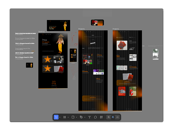
Problem
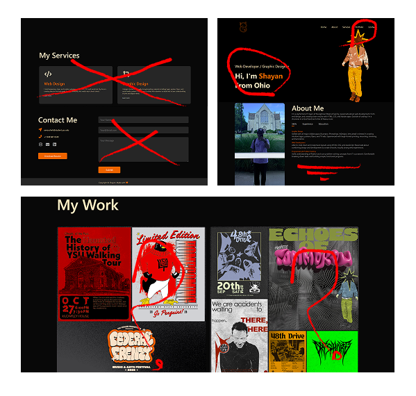
- The original site was built directly in HTML/CSS with no design plan, so the layout felt unbalanced and inconsistent.
- Several sections felt unnecessary or outdated (contact form, services, long about section).
- Visual style, typography, and spacing didn’t align with my current design taste or identity.
- The portfolio section was crowded, poorly separated, and difficult to scan, making it hard for users to understand my work quickly.
Approach
reviewing
I started by reviewing my old portfolio and writing honest feedback about what felt confusing, crowded, or outdated. I also asked a few friends to navigate the site and tell me where they struggled.
- Bad spacing
- Bad fonts
- Two “About” sections (not needed)
- Extra sections
- Not separated well
- Outdated
Approach
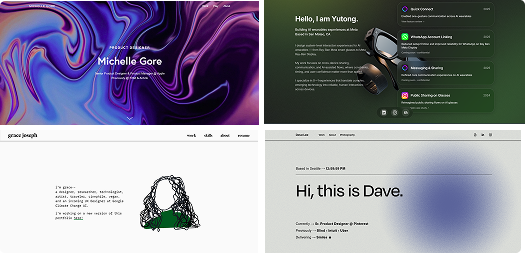
researching
Next, I explored modern portfolios and UI galleries (including CoFolio and PaFolio) to understand what makes a portfolio simple, clear, and professional.
Approach
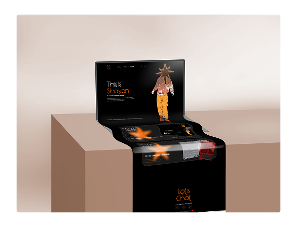
redesign
I then began learning trendy Figma tricks by recreating designs from tutorials. After a few practice sessions, I felt confident enough to design my new portfolio layout from scratch. My goal was to keep the design simple, consistent, and effective focusing on hierarchy, spacing, and showing my work clearly. I’m happy with the direction and how much cleaner it feels.
What I learnt
achievement
I learned how much impact small layout decisions can have, and how planning in Figma first leads to a cleaner, more intentional final design. Throughout the project I became much more comfortable in Figma, picked up shortcuts and workflows, and started thinking more like a systems designer instead of “just arranging elements.”
After finishing the Figma layout, I used AI to help translate the design into clean HTML/CSS. It handled some of the repetitive boilerplate so I could focus more on structure, spacing, and small visual details. I still made all the design decisions myself AI just helped me move faster and keep the code consistent.