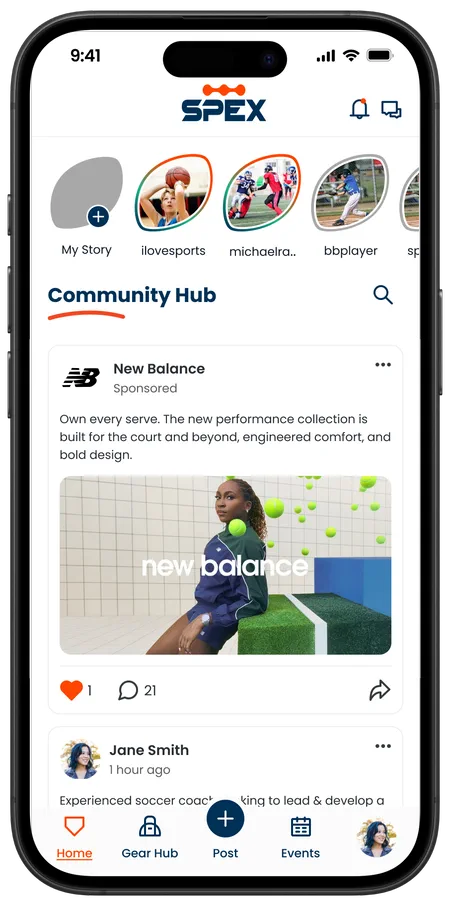
Ads that fit the feed.
Designing a 3-tier ad marketplace and monetization system for a pre-launch sports social app.
Context
What Spex is
Spex is a pre-launch sports social app for athletes, coaches, and parents. It brings the athletic community into one place to post, buy and sell used gear, and find events and competitions nearby.
What I did
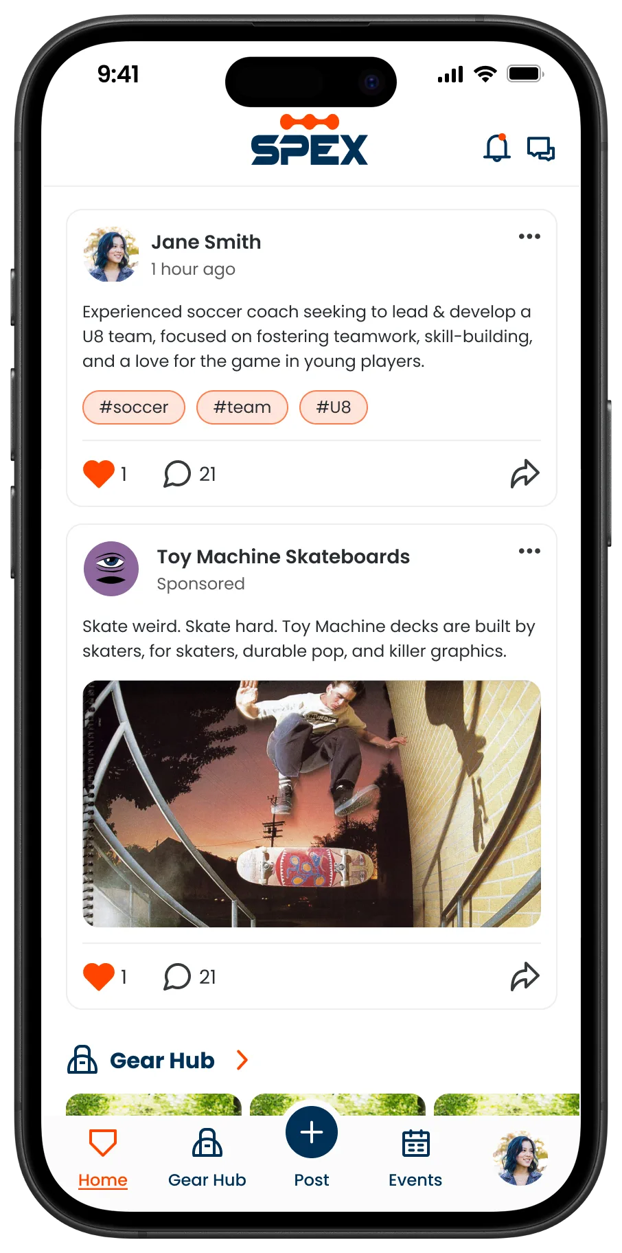
The ads and sponsored posts section hadn’t been assigned to anyone, so I took it on and built it from the ground up. The same ad had to work in four placements at different sizes, so it needed one consistent system.
My goal was ads that support the business without getting in the way of the feed.
Final artifacts
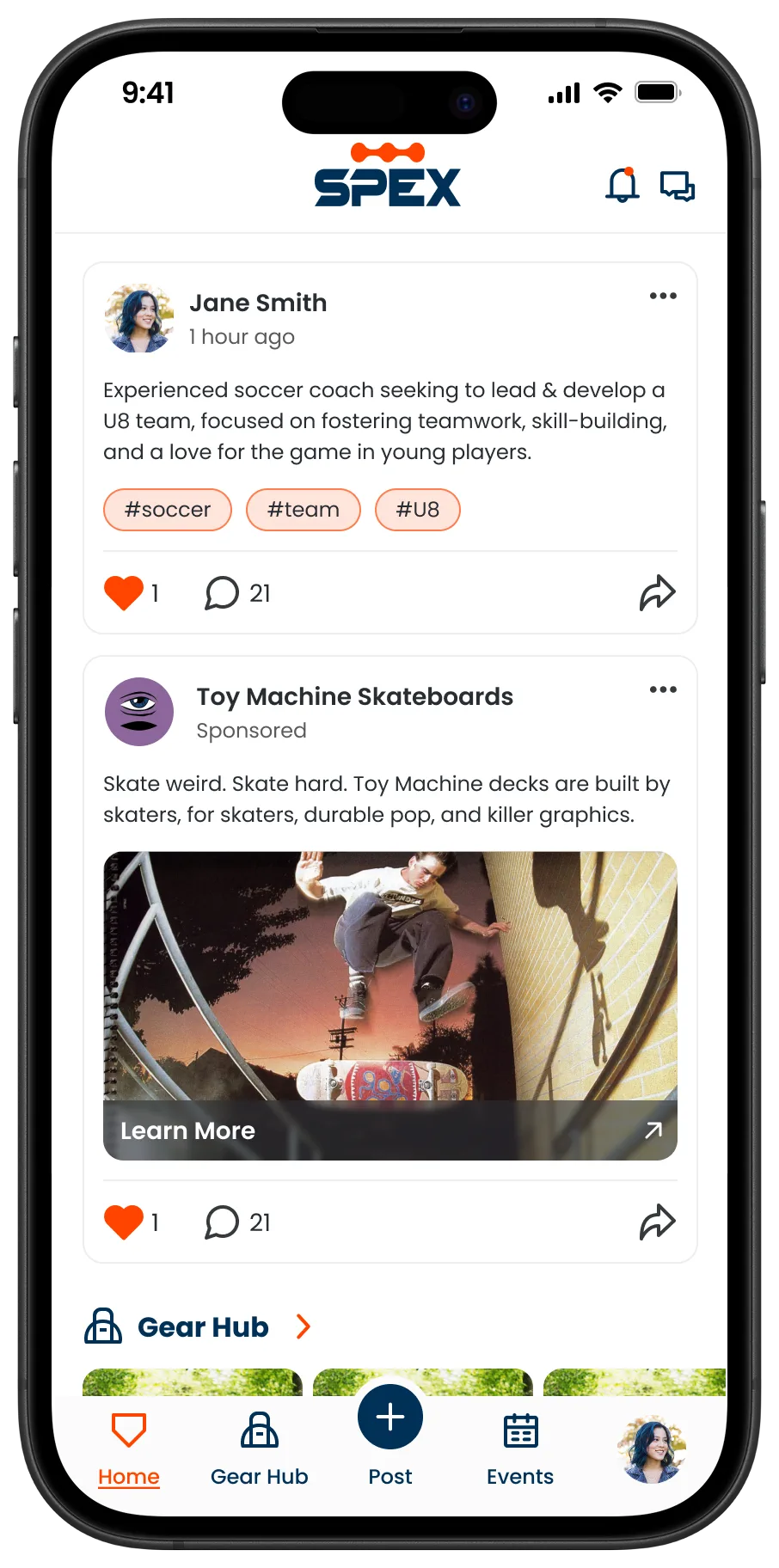
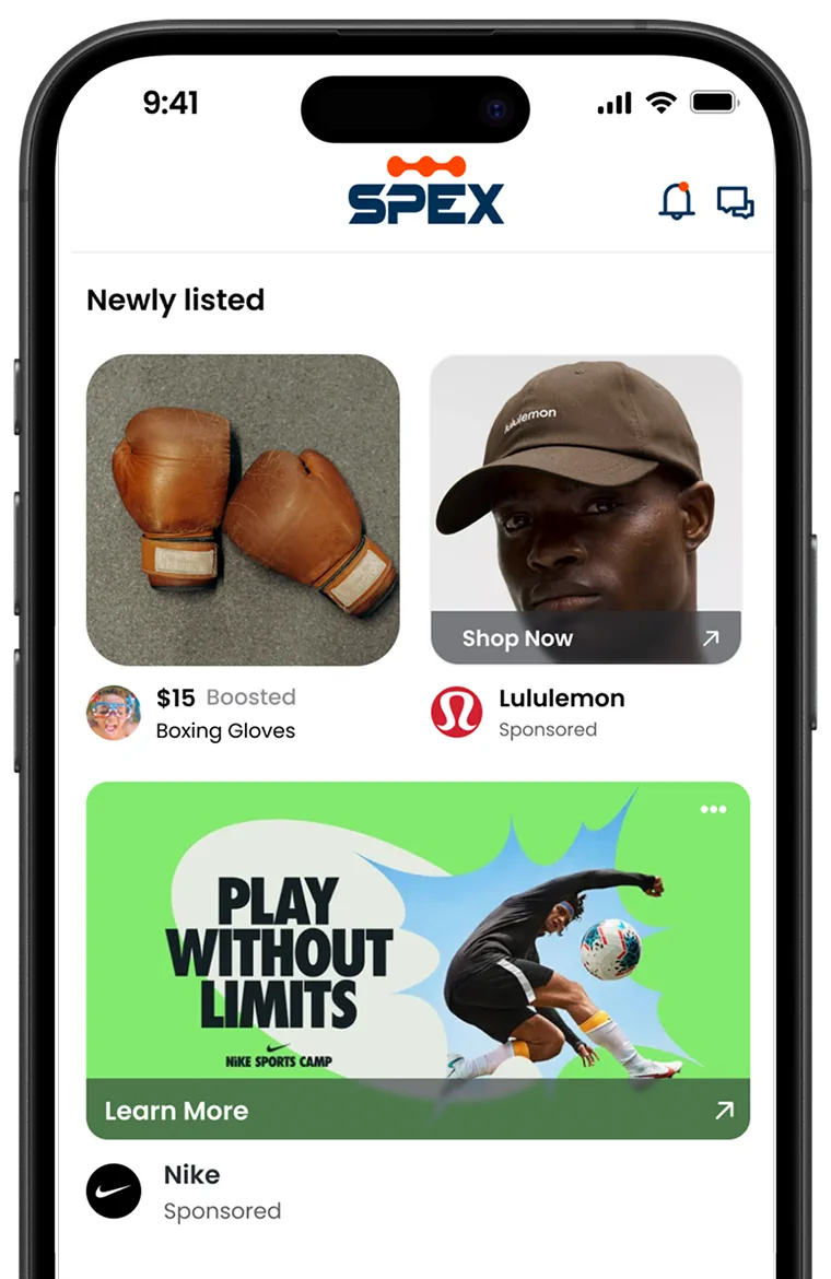
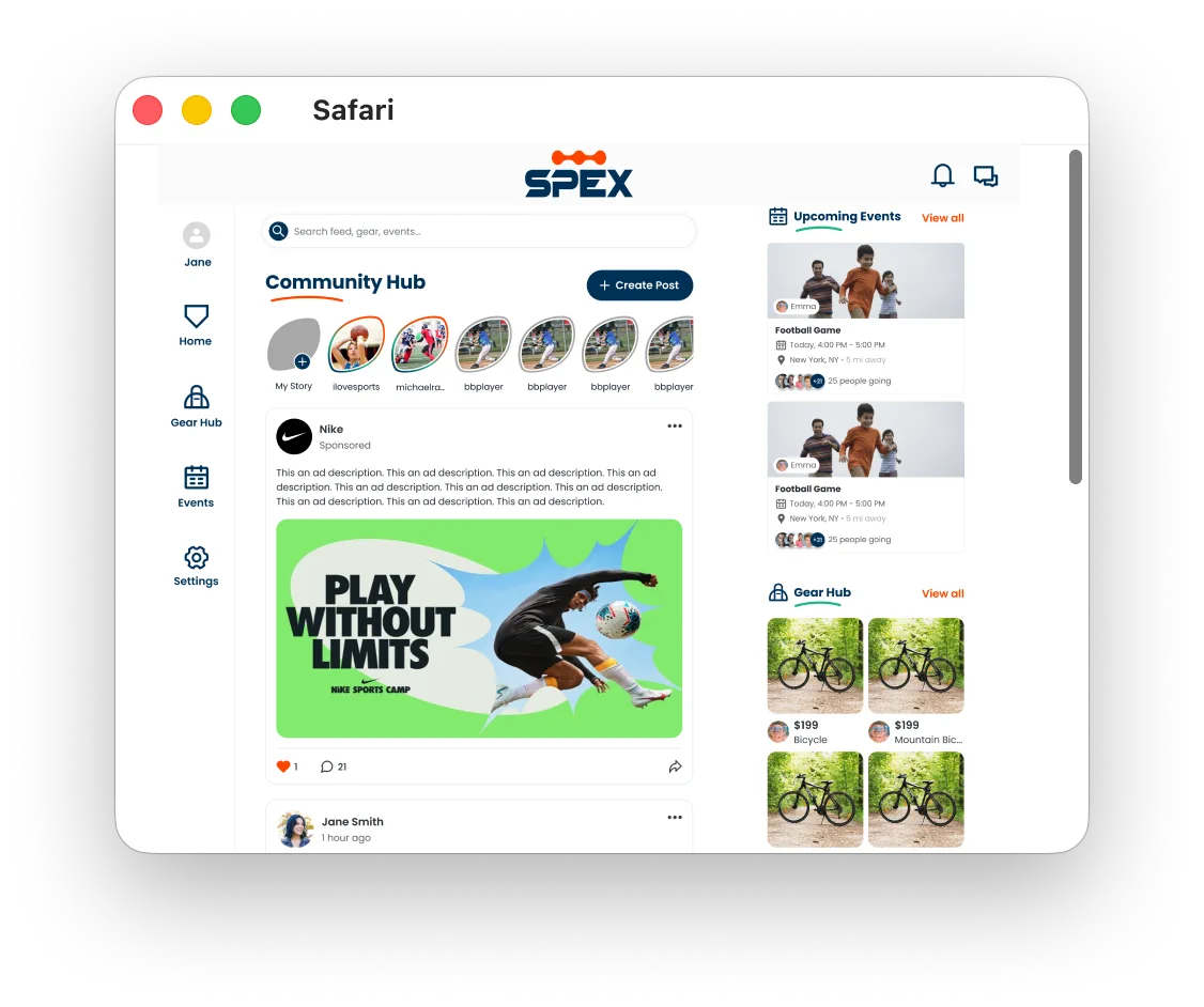
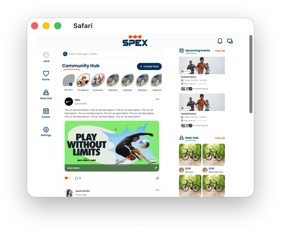
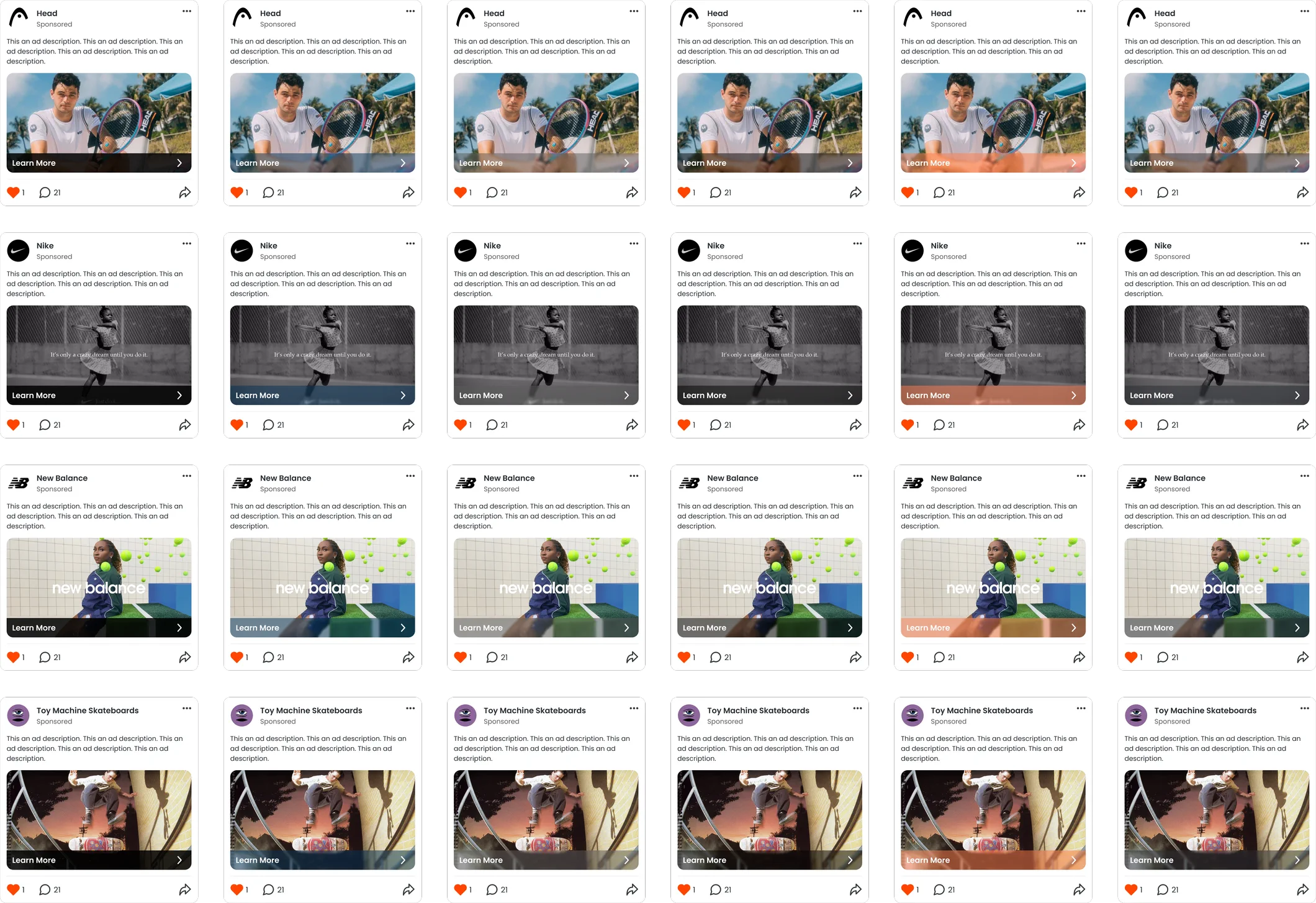
One system, both hubs
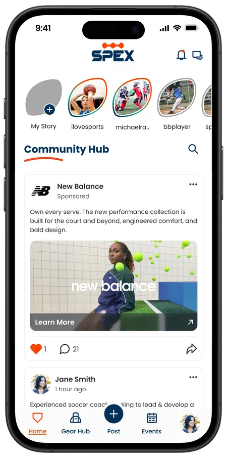
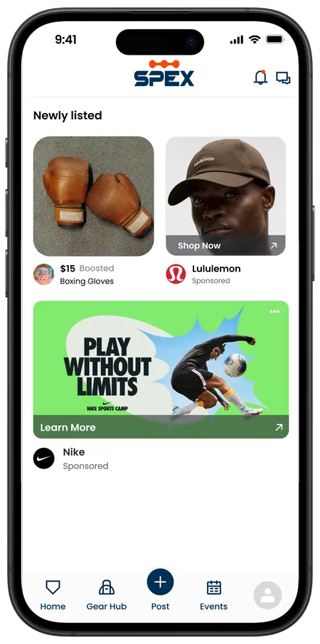
Learn More only appears when someone seems interested. On phone that’s a pause while scrolling; on web it’s a hover. Useful without being in your face.
Key design moments
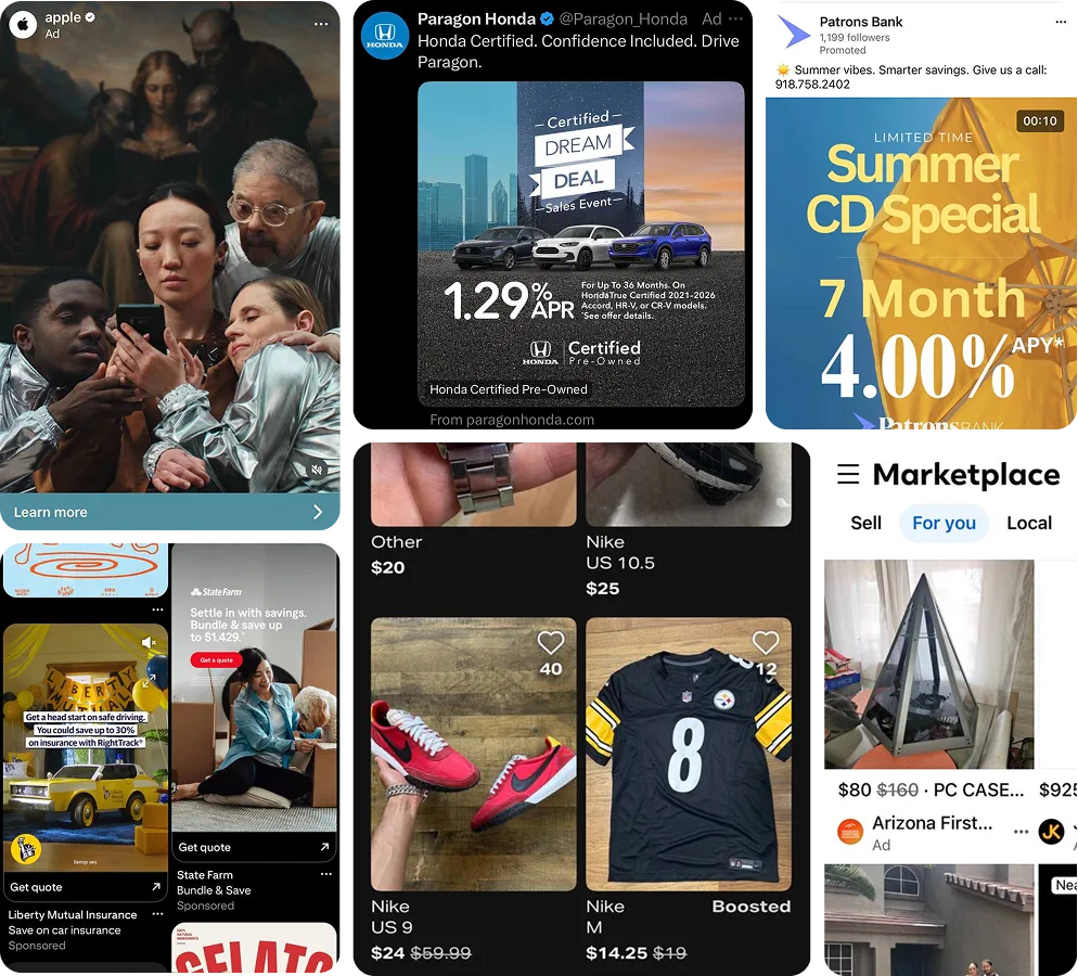
Learning from other feeds
A good ad gets noticed and earns trust without being in your face. Push too hard and it annoys people, which is bad for both the app and the brand paying for it. That balance shaped everything I designed.
Competitive analysis
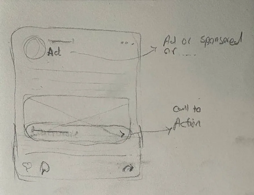
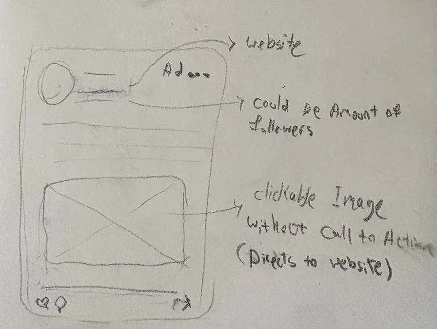
Lo-fi sketches
Starting on paper
I pulled the best parts from each and shaped them into one ad interface that felt unique but still polished.
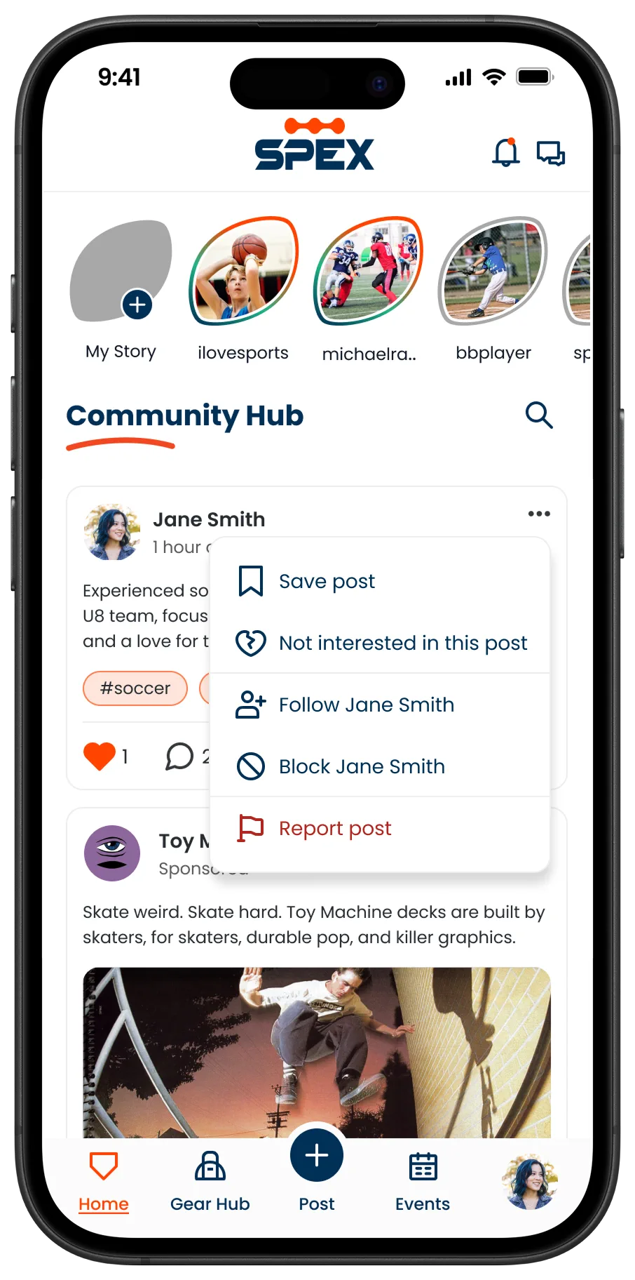
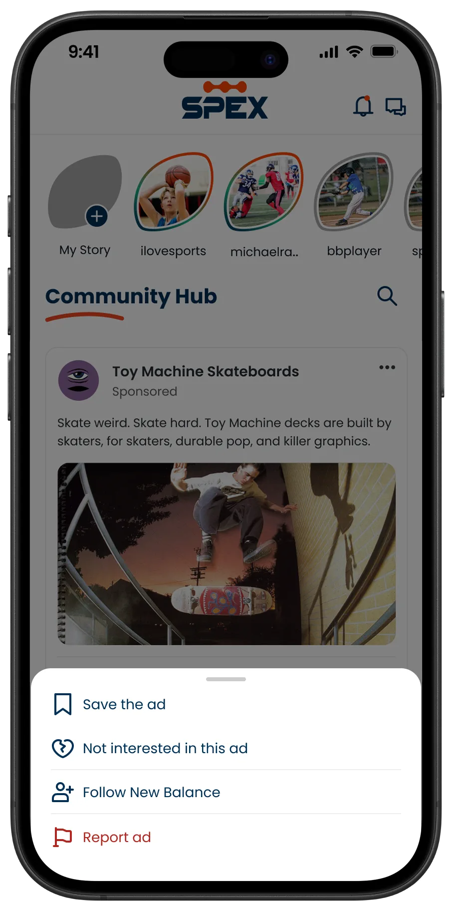
Before / after
Giving users control over ads
Another designer on the team had started a three dot menu for regular posts, but it wasn’t built yet. When I designed one for ads, I picked up where they left off, kept what worked, and fixed a few issues.
I kept the overlay menu on desktop. For phone, the team and I agreed a bottom sheet felt more modern and thumb friendly, so I moved it there. Now you can report an ad in a few taps, or write the report in the same spot.
A reusable system.
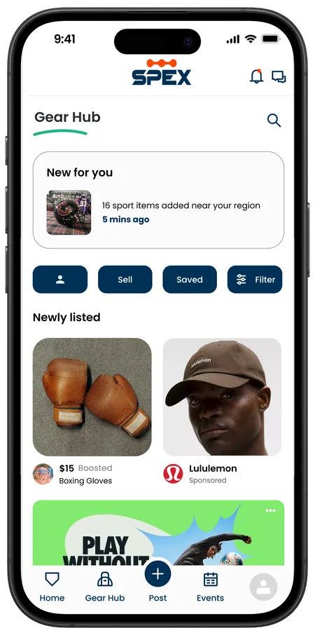
I designed one ad system that stays consistent across the whole app: sponsored ads in the Community Hub, normal and big banner ads in Gear Hub, and boosted posts for regular sellers. Same design language, different sizes and places, then carried over to the web version with a few changes.
Built reusable design-system components, and ran WCAG AA contrast checks to keep calls to action legible over imagery.
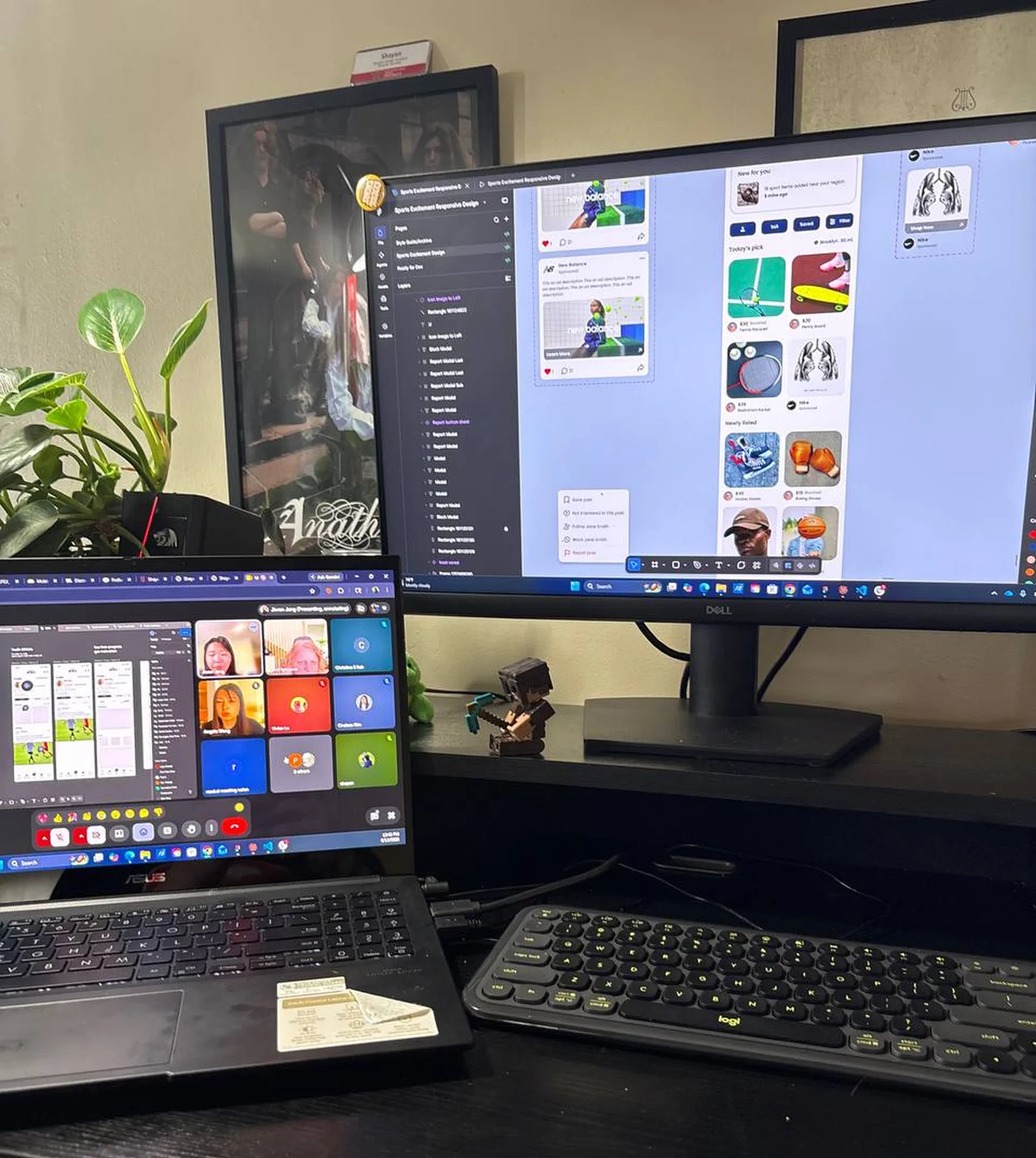
Shipping inside a
20-person team.
I worked with a twenty person design team daily. I gave and took feedback in our syncs, and my final ad component went into the main product prototype the team presents.
Reflection & thanks
I explored too many variations at first. Bringing ten options to every sync slowed the whole team down, and it was Chris, our Director of UX, who pointed out that deciding is part of the work. Learning when to stop exploring and commit made me faster, and a better teammate.
Ads and sponsored posts were mine to own, but the Community Hub they live in is a shared surface. The designers working in it were generous with their components and their reviews, and a good deal of what I shipped stands on patterns they had already solved. A genuinely supportive team to learn in.
This was my first UX internship. I came in able to make screens, and I leave able to think in flows, prototype properly, and defend a decision in a room full of designers.
Impact
Since Spex hasn’t launched, there are no numbers yet. What I can say is the system got approved, it covers every ad type consistently, and it’s now the reference for how ads look and behave in the app.